Single Page Newspaper Design
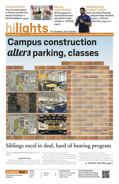
Campus construction alters parking, classes: This design came with the idea of construction imagery, and how the blueprint pictures were supposed to act as bricks, or foundations, for the renovated campus. This was the second issue of the year, and when storyboarding, our staff was disappointed in our weak design from the first issue. We wanted something as big as renovations for the school to feel dynamic and stand out. The design's simplicity, yet use of repetition, consistency and color, causes one to be drawn into the spread.
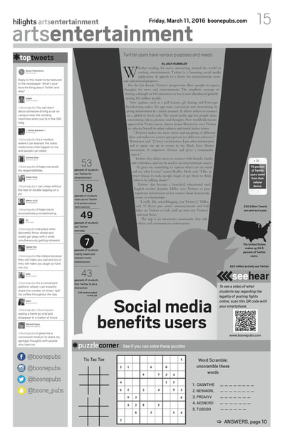
Social media benefits users: I designed this my first year on staff. The language of Adobe InDesign was still very foreign to me and I definitely did not feel acquainted to design my own page yet. To help spark my creativity, my adviser, Mrs. Burke, told me to find design inspiration. The design focused on the social media application's brand. The cloud and the bird was an inspiration I found, and the stripes added more linear elements to help draw the eye around the page from the larger graphics, to the smaller graphics and then the story. Even though it was a major challenge, it helped me become more design and software fluent for future projects.
Social media benefits users: I designed this my first year on staff. The language of Adobe InDesign was still very foreign to me and I definitely did not feel acquainted to design my own page yet. To help spark my creativity, my adviser, Mrs. Burke, told me to find design inspiration. The design focused on the social media application's brand. The cloud and the bird was an inspiration I found, and the stripes added more linear elements to help draw the eye around the page from the larger graphics, to the smaller graphics and then the story. Even though it was a major challenge, it helped me become more design and software fluent for future projects.
Double Truck Newspaper Design
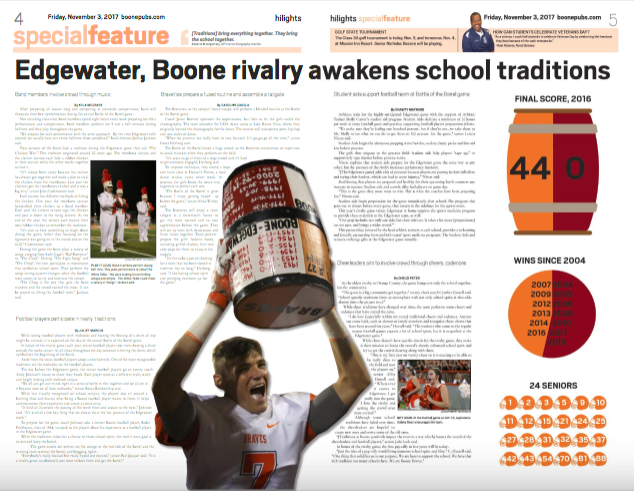
Edgewater, Boone rivalry awakens school traditions: In Orange County, the Boone and Edgewater rivalry is paramount to the respective communities. For the 65th anniversary of the rivalry game, we wanted to not only highlight football's preparation for the game, but the other organizations not always recognized on campus and what they do to prepare. The design's central element creates a natural flow for the eye to jump from one story to the next. The central image of the player holding the coveted barrel helped convey the excitement the game brings community wide.
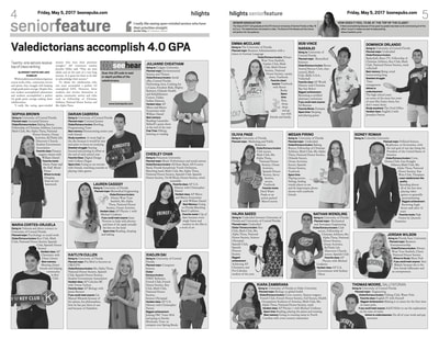
Valedictorians accomplish 4.0 GPA: Last year, Boone had 20 valedictorians and 1 salutatorian. Trying to figure out how to fit them all in two pages proved challenging. While the design is not entirely "pushing the envelope," I chose this to represent me because of the efforts required to complete this. Cobbing all of the students, creating the semi-equal boxes, typing their bios and making sure their photos reflected their personalities was not easy, but in the end, the design is traditional, clean and visually appealing.
Valedictorians accomplish 4.0 GPA: Last year, Boone had 20 valedictorians and 1 salutatorian. Trying to figure out how to fit them all in two pages proved challenging. While the design is not entirely "pushing the envelope," I chose this to represent me because of the efforts required to complete this. Cobbing all of the students, creating the semi-equal boxes, typing their bios and making sure their photos reflected their personalities was not easy, but in the end, the design is traditional, clean and visually appealing.
Web Design
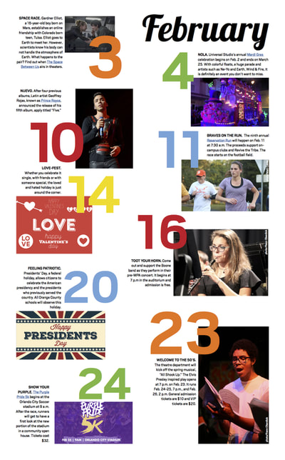
February Sneak Peeks: Each month, we take important local or broader scoped events and create them into a sneak peeks page. It's an inviting and eye pleasing way for students to read the news. I really like this design because of the different sizes of text and graphics, as well as the various intriguing colors. The natural chaos helps bring the eye across the entire page. The goal is for interactivity in readership, and these are the types of stand out graphics that make students read.
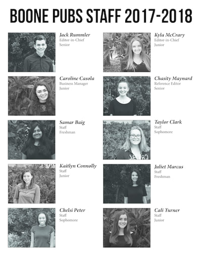
Staff Page: The staff page is a reader service that introduces the various staffers who contribute to our publication. Every year, the page is designed differently. This year, I wanted this year's page to be in black and white for visual consistency. However, each picture fluctuates in levels, contrast and brightness, making it visually different. (The graphic links to our staff page on boonepubs.com).
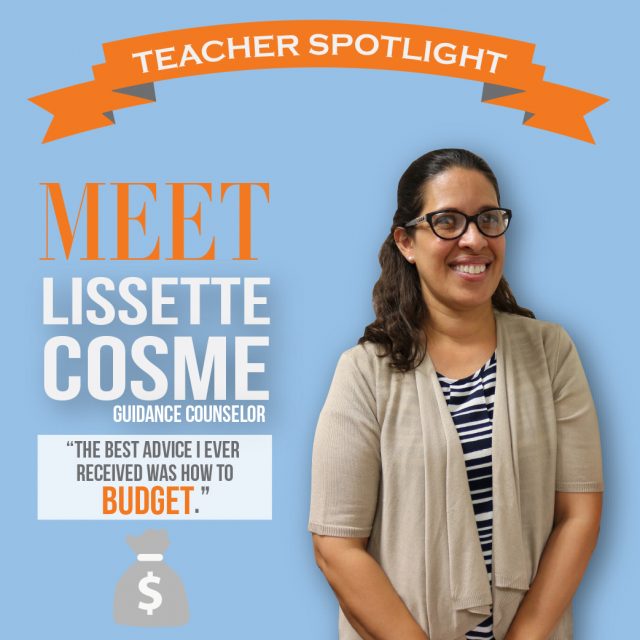
Teacher Spotlight: For two years, we have introduced the new teachers and administrators on campus. We complete a Q&A with them and create this graphic using Adobe Illustrator and Photoshop. Students learn who they are, what they do and what they look like. We also try to add something that visually represents them, along with a quote they said in their interview, to give students an interesting fact to remember about them.
Staff Page: The staff page is a reader service that introduces the various staffers who contribute to our publication. Every year, the page is designed differently. This year, I wanted this year's page to be in black and white for visual consistency. However, each picture fluctuates in levels, contrast and brightness, making it visually different. (The graphic links to our staff page on boonepubs.com).
Teacher Spotlight: For two years, we have introduced the new teachers and administrators on campus. We complete a Q&A with them and create this graphic using Adobe Illustrator and Photoshop. Students learn who they are, what they do and what they look like. We also try to add something that visually represents them, along with a quote they said in their interview, to give students an interesting fact to remember about them.
Infographic Design
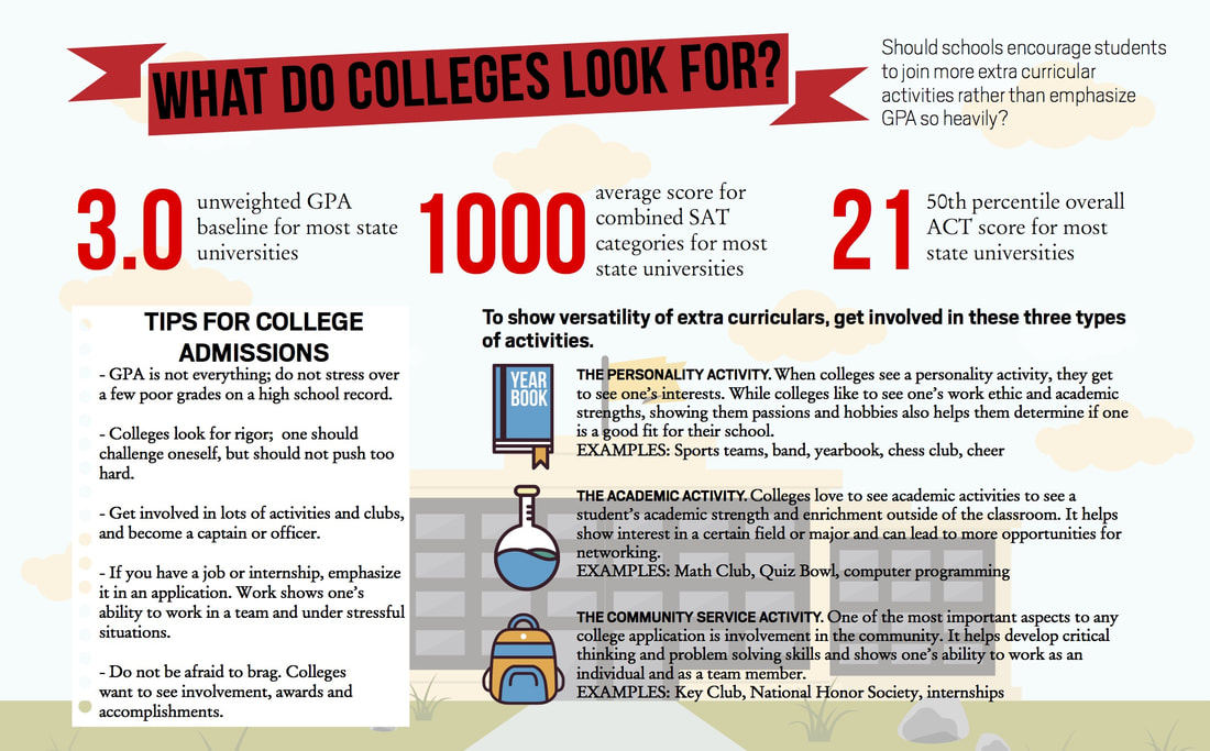
I created this infographic to supplement an opinion piece on grade point average. I wanted to cluster information that was visually appealing, but not overwhelming. It helps convey standards for college and goals students should accomplish in high school for greater success. Using Vecteezy, Adobe Illustrator and Adobe InDesign, I designed this infographic that illustrates my understanding of color usage, sizing and spacing.
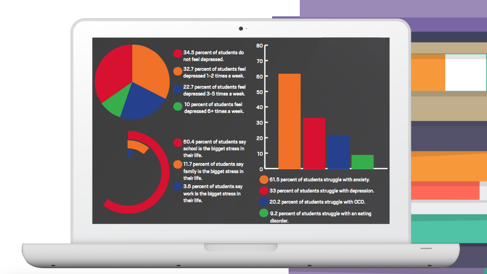
This infographic was created for a double page feature on mental illness. I wanted to design the double truck around visuals that are associated with mental illness and stress, such as technology, schoolbooks, lack of sleep and alcohol or substance abuse. The infographic is a brief look on how stress affects students, how frequently they feel depressed and what mental illnesses particularly affect them.
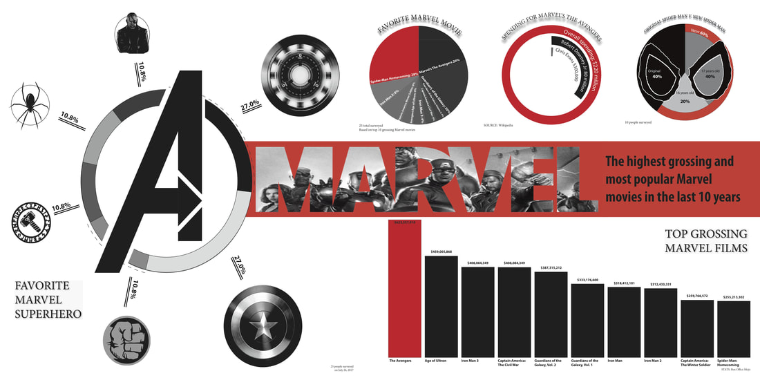
Every summer, Boone Publications attends Camp Orlando, a journalism workshop. Every attendee has one class he must attend to execute projects in an aspect of journalism and media. This past summer, I took an Advanced Illustrator and Photoshop class. With newspaper editor Kyla McCrary and yearbook editor Douglas Page, we created the infographic on the Marvel movie industry. The Marvel infographic shows top grossing films, favorite characters and success of different films.
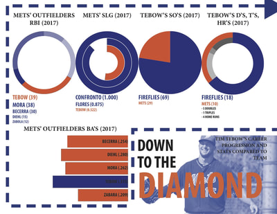
The infographic on the right was an individual project. Each student had to create an infographic on Tim Tebow's baseball career in a small allotment of time. Considering the time constraint, this was not my final version; however, it illustrates my understanding for both programs and how to use vectors, charts/graphs, color and size to guide the eye throughout the visual.
I earned second place at the awards ceremony for my infographic.
